Moonlight Work
Brand
Website
After a decade working at San Francisco’s top coffee spots, Josh launched a venture of his own. He knew that Better Half would be “a love letter to the San Francisco coffee community,” and together we realized the visual expression of his new brand.
Better
Half
Coffee
Moonlight Work
Brand
Website
After a decade working at San Francisco’s top coffee spots, Josh launched a venture of his own. He knew that Better Half would be “a love letter to the San Francisco coffee community,” and together we realized the visual expression of his new brand.
Better
Half
Coffee
Moonlight Work
Brand
Website
After a decade working at San Francisco’s top coffee spots, Josh launched a venture of his own. He knew that Better Half would be “a love letter to the San Francisco coffee community,” and together we realized the visual expression of his new brand.
Better
Half
Coffee
Freelance Work
More Info
2023–24
My Roles
→
Brand Design
→
Print Design
→
Illustration
→
Web Design
→
Web Development (via Webflow)
Freelance Work
2023–24
My Roles
→
Brand Design
→
Print Design
→
Illustration
→
Web Design
→
Web Development (via Webflow)
More Info


History and Hospitality
San Francisco’s cultural history is rich, and proved to be a fruitful source of inspiration. Beat poet book covers and photos from that era laid the foundation for much of the final brand language. Connection over coffee is Better Half’s reason for being, and through the sketching process, “shared gaze” revealed itself as a potent metaphor.
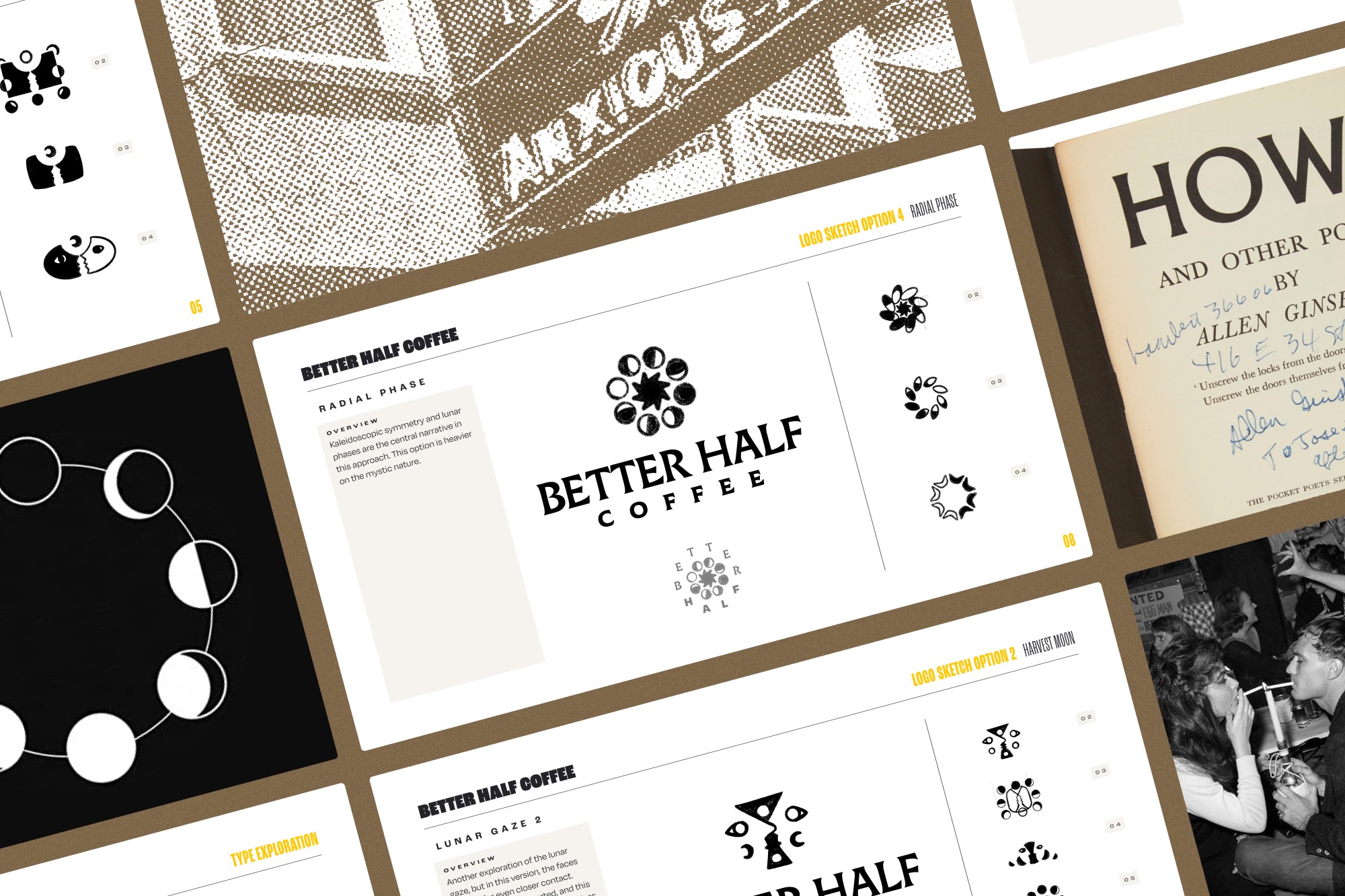

Harmony in Contrast
The resonant tone we struck with the Better Half brand played with the contrast of dark and refined with bright and inviting. The sharp logotype set atop a milk chocolate background; a vivid sunset palette within a chevron edged container. Every visual element was designed in service of contrast and balance, the key ingredients for both a vibrant community and memorable cup.


work As a member of
Material+
More Info
Project Duration
My Roles
→
Responsibility 1
→
Responsibility 2
→
Responsibility 3
→
Responsibility 4
→
Responsibility 5
Collaborator Credits
Role Category 1
Name 1
Role Category 2
Name 2
Role Category 3
Name 3
Role Category 4
Name 4
Role Category 5
Name 5
Role Category 6
Name 6